
Ark UI
ark-ui.com
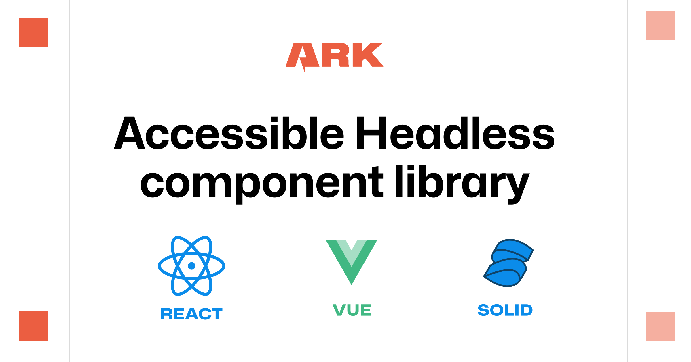
Headless, accessible components for React, Vue, Svelte, and Solid design systems.
Component Library
- Stacks
- ReactVueSvelteSolidJSTypeScript
- Use cases
- Accessibility-firstDashboards
Installation
npm install @ark-ui/reactpnpm install @ark-ui/reactnpm install @ark-ui/vuenpm install @ark-ui/solidnpm install @ark-ui/svelteclaude mcp add ark-ui -- npx -y @ark-ui/mcpGetting started
- Install the package for your framework, one of `@ark-ui/react`, `@ark-ui/vue`, `@ark-ui/solid` or `@ark-ui/svelte`. There is one package per framework and every component ships from it. Peer ranges are React and react-dom >=18.0.0, Vue >=3.5.0, solid-js >=1.6.0, Svelte >=5.20.0.
- Import a component from its own subpath, for example `import { Dialog } from "@ark-ui/react/dialog";`, then compose its parts (`Dialog.Root`, `Dialog.Trigger`, `Dialog.Backdrop`, `Dialog.Positioner`, `Dialog.Content`, `Dialog.Title`, `Dialog.CloseTrigger`).
- Style every part yourself. Ark UI ships no default styles, but each part carries `data-scope` and `data-part` attributes, so plain CSS can target them: `[data-scope='slider'][data-part='root'] { ... }`. Interactive parts also expose `data-state`.
- With Tailwind CSS, pass classes to each part and style states with variant selectors such as `data-[state=open]:bg-gray-100`. With Panda CSS, build a `defineSlotRecipe` from the anatomy object, imported from the anatomy subpath (`@ark-ui/react/anatomy`) rather than the main export.
- For AI tooling, Ark UI publishes an index at https://ark-ui.com/llms.txt, per-framework docs at https://ark-ui.com/llms-react.txt, https://ark-ui.com/llms-vue.txt, https://ark-ui.com/llms-svelte.txt and https://ark-ui.com/llms-solid.txt, and an MCP server at `@ark-ui/mcp`.
Agent setup prompt
Paste this into a coding agent to set Ark UI up in an existing project.
Add Ark UI to this existing project.

Ark UI (https://ark-ui.com) is a headless component library maintained by the Chakra UI team, built on Zag.js state machines. It ships unstyled, accessible component primitives for React, Vue, Solid and Svelte, so it contributes behavior and markup but no visual styles.

Prerequisites:
- An existing app in one of React, Vue, Solid or Svelte, with Node.js and a package manager available. Peer ranges: React and react-dom >=18.0.0, Vue >=3.5.0, solid-js >=1.6.0, Svelte >=5.20.0.
- A styling solution already in the project (CSS, CSS Modules, Tailwind CSS or Panda CSS). Ark UI has no default styles, so nothing renders styled until you style the parts. For a ready-made styled layer, Park UI (https://park-ui.com) builds on Ark UI.

Steps:
1. Read the official docs for the project's framework before writing code: https://ark-ui.com/react/docs/overview/getting-started (swap react for vue, solid or svelte). Only use import paths and part names documented there.
2. Install the package that matches the framework, from the project root: "npm install @ark-ui/react", "npm install @ark-ui/vue", "npm install @ark-ui/solid" or "npm install @ark-ui/svelte".
3. Import a first component from its subpath, for example: import { Dialog } from "@ark-ui/react/dialog"; then assemble the parts documented for that component (Root, Trigger, Backdrop, Positioner, Content, Title, Description, CloseTrigger). Copy the structure from the component's docs page rather than guessing part names.
4. Style the parts. Each part exposes data-scope and data-part attributes, so plain CSS can target a single part; Tailwind CSS can be applied directly per part with data-[state=open]: style variants for state; Panda CSS recipes should take their anatomy object from the "@ark-ui/<framework>/anatomy" subpath.
5. Confirm the component works before adding more: open and close it, tab through it, and check that focus, keyboard navigation and positioning behave correctly.
6. Optional: give your editor the docs. Point your tool at https://ark-ui.com/llms.txt (or the per-framework file, for example https://ark-ui.com/llms-react.txt), or add the official MCP server with "claude mcp add ark-ui -- npx -y @ark-ui/mcp", documented at https://ark-ui.com/react/docs/ai/mcp-server.

Do not add a second component library, and do not invent props or parts: check the component page at https://ark-ui.com/<framework>/docs/components/<component> first.