
Park UI
park-ui.com
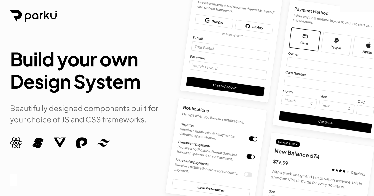
Styled, customizable design system components built with Ark UI and Panda CSS.
Component Library
- Stacks
- ReactTypeScript
- Use cases
- Accessibility-firstDashboards
Installation
npm install @ark-ui/react lucide-reactnpm install @ark-ui/solid lucide-solidnpx @park-ui/cli initnpx @park-ui/cli add buttonnpx @park-ui/cli add tealpanda codegenGetting started
- Prerequisite: Panda CSS must already be installed and configured. Park UI generates its CSS through Panda, so follow the Panda CSS getting started guide at https://panda-css.com/docs/overview/getting-started first. The docs at https://park-ui.com/docs/installation state this prerequisite explicitly.
- Install the headless foundation and an icon set: `npm install @ark-ui/react lucide-react` for React, or `npm install @ark-ui/solid lucide-solid` for Solid. Park UI has no component npm package of its own; every component is built on Ark UI primitives and styled with Panda CSS recipes.
- Run `npx @park-ui/cli init` from the project root to set up the config files and directories, then run `panda codegen`. The docs repeat the instruction to re-run `panda codegen` any time the Panda config changes.
- Add components one at a time with the CLI, for example `npx @park-ui/cli add button`, then import them from your source directory, e.g. `import { Button } from "@/components/ui"`. Add more color palettes at any time with `npx @park-ui/cli add teal`.
- Components land in your repo as editable source together with their Panda recipe, so variants, sizes and styling are changed by editing the recipe file. The older `@park-ui/panda-preset` package is no longer part of setup. Theming rules (sizes, the five shared variants, Radix Colors palettes) are at https://park-ui.com/docs/theming.
Agent setup prompt
Paste this into a coding agent to set Park UI up in an existing project.
Add Park UI to this existing project.

Park UI (https://park-ui.com) distributes component source code rather than an npm package. Components are built on Ark UI headless primitives and styled with Panda CSS recipes, and each component is copied into the repo so you can edit it directly.

Prerequisites:
- Node.js and npm are available.
- Panda CSS is the prerequisite: a working Panda project with a panda.config.ts must already exist. If it does not, stop and set it up from https://panda-css.com/docs/overview/getting-started first, because Park UI writes its recipes into that config and Panda generates the CSS.

Steps:
1. Read the official setup guide at https://park-ui.com/docs/installation before changing anything. Use only the commands documented there.
2. Install the headless foundation and icons. For React: npm install @ark-ui/react lucide-react. For Solid: npm install @ark-ui/solid lucide-solid. Do not look for a @park-ui components package; there isn't one.
3. Run npx @park-ui/cli init from the project root, then run panda codegen. Re-run panda codegen whenever the Panda config changes, otherwise the generated styles are stale.
4. Add the first component with npx @park-ui/cli add button, then import it from the CLI's output directory, for example: import { Button } from "@/components/ui". Render it in an existing page and confirm the build still passes.
5. Add further components the same way, and add more color palettes when needed with npx @park-ui/cli add teal.
6. Customize by editing the component's Panda recipe in the repo. Park UI ships a shared sizing scale (primary vs secondary components share heights for a size token) and five variants: solid, subtle, surface, outline and plain. Colors follow Radix Colors with 12 shades per mode, and you pick one accent plus one gray at init time. Details: https://park-ui.com/docs/theming.

Notes:
- The former @park-ui/panda-preset package is no longer part of setup; recipes are written into the project so they stay editable.
- The repository moved to the Chakra UI organization: https://github.com/chakra-ui/park-ui. The old https://github.com/cschroeter/park-ui URL redirects there.
- Copy source and view component recipes at https://park-ui.com/docs/components/button, and use the props tables on each component page rather than inventing props.