
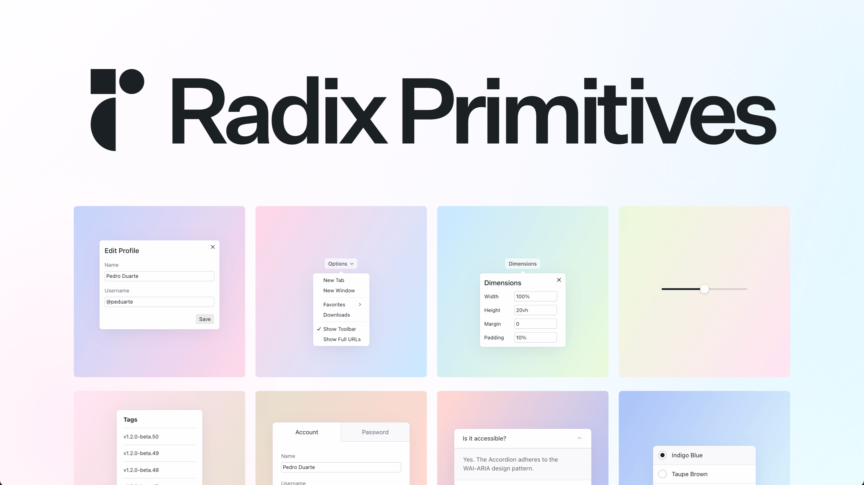
Radix UI
radix-ui.com
Unstyled, accessible primitives for building high-quality design systems and web apps in React.
Component Library
- Stacks
- ReactTypeScript
- Use cases
- Accessibility-firstDashboards
Installation
npm install radix-ui@latestnpm install @radix-ui/react-dialogGetting started
- Run `npm install radix-ui@latest`, or install a single primitive such as `npm install @radix-ui/react-dialog`.
- Import a primitive, for example `import { Popover } from "radix-ui"`, and compose its parts (Root, Trigger, Portal, Content). Each primitive also ships its own entrypoint like `radix-ui/popover`.
- Add your own CSS. Primitives are unstyled: there is no config step and no stylesheet to import, you pass classNames and style the parts yourself.
- Render the component and rely on the built-in keyboard handling, focus management and WAI-ARIA semantics instead of re-implementing them.
- Look up each component's props and accessibility notes in the docs before wiring it up.
Agent setup prompt
Paste this into a coding agent to set Radix UI up in an existing project.
I have an existing React project (React 18 or newer, TypeScript optional) and want to add Radix UI Primitives for accessible, unstyled components. Install them with `npm install radix-ui@latest`; individual primitives are also published as their own packages, for example `npm install @radix-ui/react-dialog`. There is no config step and no global CSS file to import, since the primitives ship unstyled. Add a first component as a working example: import { Popover } from "radix-ui" and render Popover.Root with Popover.Trigger, Popover.Portal and Popover.Content, then apply our own classNames to each part. Do not rebuild keyboard handling, focus management or ARIA roles, those are included. Before choosing props, read the component's page in the official docs at https://www.radix-ui.com/primitives/docs.